The Non-Designers Design Book Chapters 5-14
Chapter 5: Contrast
A technique that adds visual interest to your design is contrast! Contrast is done when you make two items look really different from one another.
This text is different than this text. So it stands out more and draws attention to intentional items in your design.
You can use the following to develop CONTRAST:
- Line thickness
- color
-
shape
-
size
- s p a c e
- AND MORE
Chapter 6: Review of Chapters 1-5
Proximity-Group items related to one another together
Alignment-Use an alignment pattern to create organization and uniformity
Repetition-Consistency is chosen design elements brings the design pattern together
Contrast-Add contrast by making items very different than one another
Chapter 7: Using Color
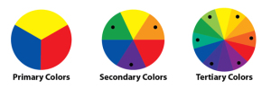
The color wheel!
Start with yellow, red and blue the PRIMARY colors.
Mix the primary colors together to make SECONDARY colors.
Mix colors that are next to each other together to make TERTIARY colors.
COMPLEMENTARY colors are opposite from each other on the color wheel.
So that means Christmas colors Red and Green are complementary-I imagine that is why they are used together then!
TRIADS are three colors that connect them together-making them appealing to use together.
Triads can be identified being between 3 colors on the wheel for example:
The primary colors Red, Yellow and Blue are a triad.
SPLIT COMPLEMENT TRIADS are found by picking a color on the wheel. Let’s pick Blue.
You go directly across the wheel to Blue’s complement which is orange. But to form the split complement you chose the two colors around orange instead so Yellow-Orange and Red-Orange.
ANALOGOUS colors are ones that are next to each other on the wheel such as Bluish-purple, purple and violet.
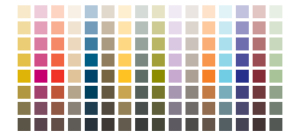
Shades and Tints are variations in a color. The color itself is called the HUE. Add black and its a SHADE. Add white and its a TINT.
MONOCHROMATIC colors are combinations of one hue in various tints and shades. It creates a nice look-think old photos.
Shades and tints works in combos with complementary colors as well.
Be wary of too many dark colors- there isn’t enough contrast!
Use less warm colors than cool colors. Too much red and yellow in a design can be overwhelming!
CMYK=Cyan, Magenta, Yellow and Key are ink colors used for printing images-you probably have seen that when changing your printer ink/
RGB= Red, Green, Blue are what is used to produce the images we see when we look at our computers, phones, TVs etc.
Chapter 8: Extra Tips & Tricks
Tips on how to create uniform design pieces. WHAT NOT TO DO on a business card stick things in corners, 12 point font, or fill up all the space.
Letterheads and envelopes. WHAT NOT TO DO on them is use different designs on the letterhead and envelope, center everything, use Times, Arial Helvetica or Sand fonts.
Flyers! WHAT NOT TO DO on them is put everything in a box, use Times, Arial, Helvetica or Sand fonts, use hyphens for bullets, center everything, use gray, or have hyphen breaks.
Similar design tips for various other documents.
Chapter 9: Type & Life
Concordant-one type of family. NOT VERY INTERESTING!
Conflicting-combining similar typefaces. THIS IS VERY UNAPPEALING!
Contrasting-combining separate typefaces. THIS IS SO AWESOME!
Chapter 10: Categories of Type
- Oldstyle- best choice for a lot of text, but boring if you want to stand out.
- Modern-not good for body work, but very striking!
- Slab serif-slight thin to thick contrast, readable, straightforward
- Sans serif -monoweight and without serifs
- Script-limited use. but they look pretty.
- Decorative-limited use but are fun!
Chapter 11: Type Contrasts
Size
- Make sure your contrast is actually contrast.
-
This
-
And this are different but don’t look much so…
-
-
THIS
-
AND THIS ARE VERY DIFFERENT AND ARE CONTRASTED
-
Weight
- The thickness of the lines of the type!
- Again strong contrast is key to using different weights. The more different the better!
Structure
- Using typefaces that are all from different types will help keep your design from looking conflicted.
Form
- The actual shape of the type. CAPS versus lowercase is a good contrast of form.
- Bold and italic are contrasts of form.
Chapter 12: Does it all make sense?
I really understand the concepts that are presented in this text. I think these are all really helpful to creating and designing visually appealing works.
I will include a what not to do self-made publication and one using the concepts.
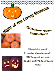
What NOT to do:
There is a lot wrong with this publication! YIKES. The alignment is all over the place. There is contrast but not enough it clashes. The images are just trying to fill up space.
The body typeface is hard to read. There is no location information.
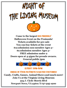
WHAT TO DO:
I don’t attest to this being great, because I made it quick. But it does a better job at being appealing and readable in comparison to the first one.
The alignment is the same. The contrast is there between the background and text. The body text is easily readable. Decorative style font is used for the title only and emphasis sentences and words. Pictures are used sparingly.
Comments this week:
Sarah Camp’s post: http://scamp030.grads.digitalodu.com/?p=144#comment-16


